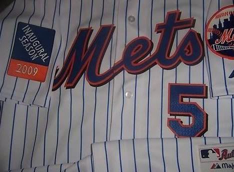
Have you ever in your life seen a worse logo than the one below? The Mets are wearing this patch on their uniform  sleeves to 'celebrate' the first season at the new Citifield. What kind of celebratory patch is it when it is this when it's so non-festive? I've never seen anything so boring in my life. It's the most weak, bland, vanilla, dull, uninspiring, undistinctive and downright awful thing I have ever seen.
sleeves to 'celebrate' the first season at the new Citifield. What kind of celebratory patch is it when it is this when it's so non-festive? I've never seen anything so boring in my life. It's the most weak, bland, vanilla, dull, uninspiring, undistinctive and downright awful thing I have ever seen.Don't you think there could have been some sort of contest where they could have had people select logos instead of just accepting whatever piece of crap Citibank tells them to put on there? The worst part about this is that the culprit behind this patch (Citigroup) is not even going to exist in a couple months.
By the way, if you don't understand why I think this sleeve patch is so awful, just take a moment to compare it to the sleeve patch the Yankees will be wearing this season.


No comments:
Post a Comment